
Your website works nights, weekends and public holidays without complaining. Yet many companies give it less commercial direction than a junior salesperson on their first day. Then they wonder why the site looks respectable and produces very little.
Give the website a job
‘We need a new website’ is not a useful brief. Why? What should become easier for the business and for the visitor? Should the site create qualified conversations, help buyers compare options, support a sales process, explain a new category or reduce repetitive questions?
Choose the primary job before choosing layouts. A website can support several needs, but each page should know which conversation it owns.
Do not organise the homepage like the company
Internal structures make poor navigation. Visitors do not care which department owns a service. They care whether you understand the situation they are in and can help them move.
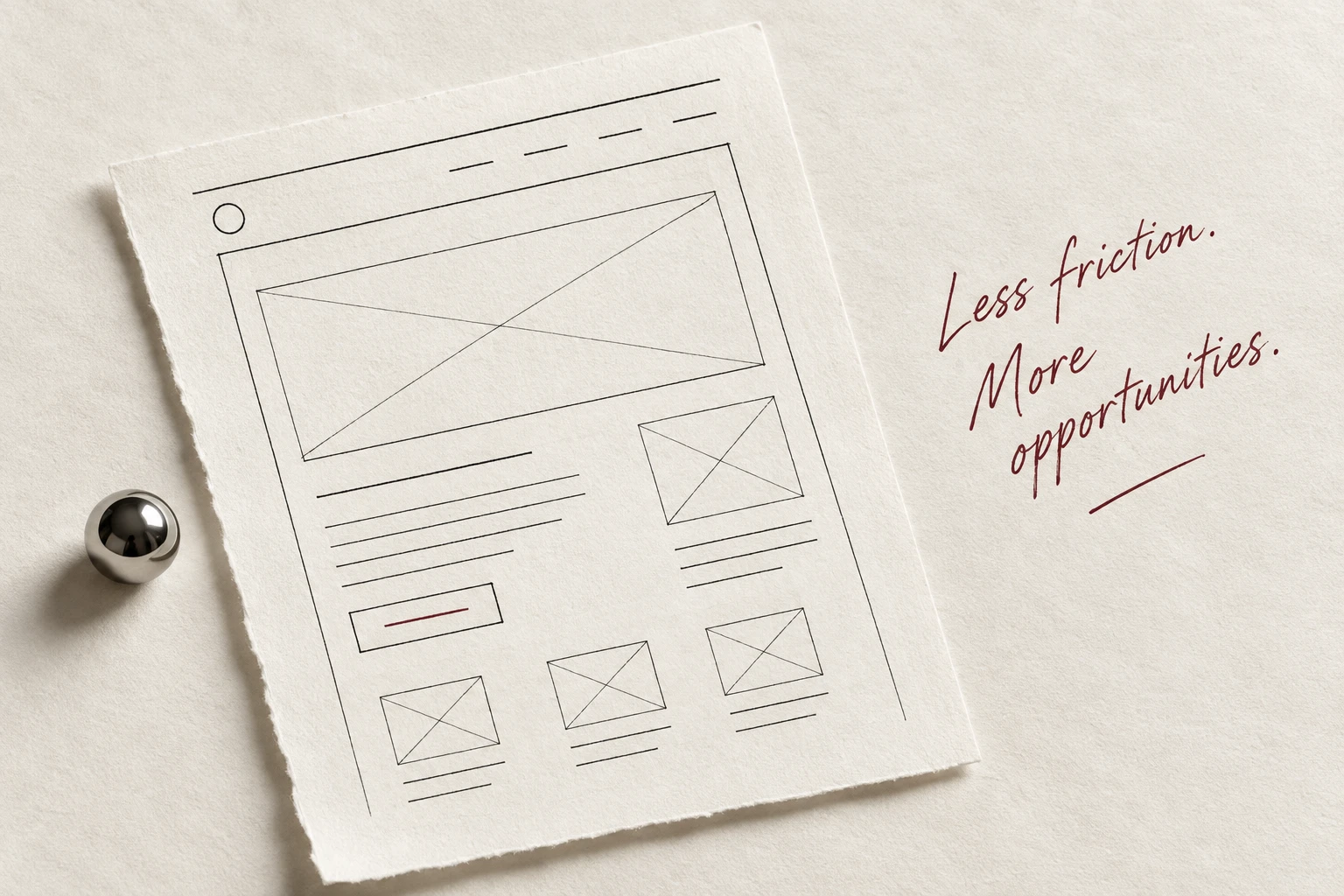
A useful homepage conversation is simple: recognise the problem, show the meaningful change, explain how you help, offer proof and make the next step feel proportionate. You can be creative inside that sequence. Just do not hide the point.
Your website never gets tired, but it can still be badly managed.
Martin Palmet
Put proof beside the promise
Websites often make a large promise at the top and store all evidence on a case-study page three clicks away. Bring proof closer. A relevant result, customer quote, concrete example or short case detail should appear when belief is required.
Avoid anonymous praise and floating numbers. Explain what changed, for whom and under what circumstances. Honest specifics are more persuasive than a wall of logos with no story.
Brief the common objections
A patient salesperson answers questions before asking for commitment. Your website should do the same. What does the work involve? Who is it for? What happens first? How long can it take? What will the client need to contribute?
You do not have to publish a legal transcript of every sales call. Address the uncertainty that stops a sensible person from taking the next step.
Make the next step fit the moment
Not every visitor is ready to book a call. Offer useful progression: read a relevant example, see the approach, check fit, send a short question or book a conversation. One loud button repeated fifteen times is not a journey.
The call to action should make clear what happens next. ‘Submit’ is a database instruction. ‘Tell me what is stuck’ is a human invitation.
Use the ten-minute website brief
For each important page, write five lines: the visitor, their situation, the page’s job, the proof required and the next useful action. That tiny brief will improve more decisions than an hour spent discussing whether the cards need softer shadows.
Then measure what the page was asked to do. Look at qualified enquiries, useful paths, sales usage and repeated questions. Traffic matters only in relation to the job.
One last thought
Keep what is useful.
A good website does not merely describe the business. It carries part of the commercial conversation, clearly and patiently, until a human should take over.